

For hundreds of years now, artists have been trying to formalise, through philosophical discussion, the effect of colour in their work. Ever since the Impressionists began to shift the focus of their art away from accurately portraying reality, and recognised that how we see is comprised of fleeting images and emotional memory, the colour palette used to capture these moments has become less reliant on objectivity but increasingly personalised by the artist.
Even long before these 20th Century philosophical ponderings, colour in art has had a long, multicultural history of representation and symbolism. Purple has represented royalty, wealth and power across civilisations due to the historic difficulty in acquiring its pure pigment; Red represents luck in China, but also its bright, destructive relationship to fire has lent its meaning to various depictions of hell; Blue, often a calming and natural colour seen in the sea and sky, also carries with it connotations of despair, depression and the cold. Don't miss our article "Abstract Art: Boundless Territory To Create".
Take a look at our article A New History of Abstract Art in Munich for a look at an exhibition championing three female 20th Century abstract painters.

From these purely representative meanings, evolved the movement most renowned for placing a specific emphasis and value on colour, Fauvism, the key players of which such as Matisse, Derain and de Vlaminck drew on their own expression to vividly separate an object from its assigned colour. Allowing colour to take on its own agency and to exist within the frame independently was a radical artistic progression, and it paved the way for all artists henceforth to openly experiment. Matisse once said,
"The chief function of colour should be to serve expression as well as possible. I put down my tones without a preconceived plan. If at first, and perhaps without my having been conscious of it, one tone has particularly seduced or caught me."
This level of unconscious response to colour, or at least an unconscious channelling of colour as an expression, shares many similarities with Wassily Kandinsky’s abstract art, for whom colour, sound, emotion and other sensory experiences often blurred into one due to his condition of synaesthesia. This condition, which means that multiple senses are often unified into one simultaneous sensation gave Kandinsky an intimate knowledge of what certain colours physically did to his being. He used this natural understanding of the links between the chromatic scale and human emotion to academically formulate many theories on the relationship between the two, much of which we still use today. His defining book, “Über das Geistige in der Kunst” (On the Spiritual in Art), first published in 1911 sets out his manifesto on topics such as colour, form, spirituality and their relation to artistic practice. Read more about the pursuit of spirituality in abstract art here.

Blue was Kandinsky’s favourite colour, for him a “typically heavenly colour” and it becomes more calming as it gets lighter and closer towards white. The link here between blue and the heavens is pretty clear, as all who have looked up into a completely blue sky can imagine. Kandinsky does state in his book, however, that colour cannot be extended ad infinitum, for example “a limitless red can only be imagined or visualised” which would mean in this example he sets the limit of his vision, literally the horizon, as the corresponding limit of the colour.
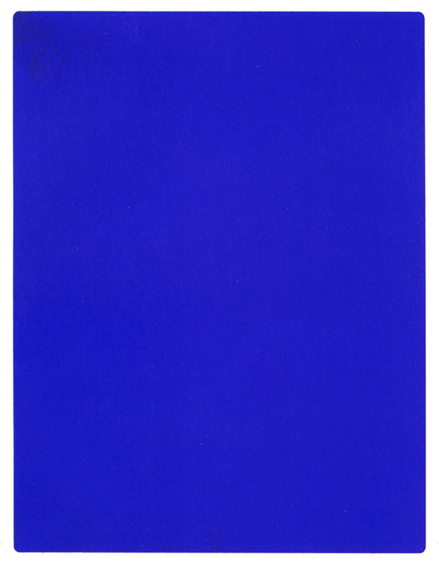
One artist with whom the colour blue is most associated, is Yves Klein, who in 1960 registered his own pigment International Klein Blue (IKB)closely . Whole paintings, sculptures, even live performers were covered singularly in this hue, immediately recognisable due to its apparent clarity, texture and a certain je ne sais quois, all rolled into one. Whilst Kandinsky could not extend colour spatially to infinity, there is a definite sense of infinity whilst looking into Klein’s solid blue canvases – not in terms of their width but in the depth that his unique blue affords the eye.

A similar extension of the infinite, but this time in red abstract art, can be found in the vast canvases of Mark Rothko. He worked in many colours, but his fiery, powerful, red, orange and yellow paintings have captured the public imagination more than most – even inspiring a current West End play “RED”, which follows his life and practice. Rothko was a major proponent of the Abstract Expressionism scene in New York, and more specifically the trend of Colour Field Painting, which would fill the canvas with large swathes of colour to remove all obvious suggestion of the artist’s hand.
At the opposite end of the spectrum, advancements in technology have recently discovered the antithesis to colour, or rather Vanta Black – the blackest black imaginable as incredibly little light is reflected back off any surface it covers. Anish Kapoor managed to license the colour for his sole use, after some lengthy legal debates, and his work with voids and space being influenced by surface and therefore colour makes this development very exciting, even though he is yet to create any art with it. Kandinsky always referred to black as “eternally silent... immovable” and as a colour that would dull those around it. In this regard Vanta Black and your average black are very different, one able to truly represent an empty silence much better than an emotional suggestion. Check out these colourful abstract painters on Kooness: Brenda Biondo, Luca Mosciariello and Kim Uchiyama.