

Hypnotizing, mesmerizing, fascinating, mind-boggling! Op Art, aka Optical Art, is all that and more. Artists had long been interested in the visual imagery that captivates and deceives the eye, yet it wasn’t until the 1960s that such interest flourished into a proper art movement of a popularity that goes beyond today. Whether they are strictly black and white or oozing with color, Op artworks can engage our attention like no others, thanks to their many historical roots and an evergreen vision.
What Is Op Art?
- Short name for Optical
- ArtAbstract Art from the 1960s
- Pure visual illusion
- “A collision of art and science”
Speaking in purely visual terms, Op Art or Optical Art is a style of the visual arts, specifically (geometric) Abstract Art, that deals with optical illusion. But unlike Kinetic Art, a field it is also a part of, it only evokes movement instead of actually endorsing it, in order to fool the eye and illicit a kind of reaction, sometimes even nausea. And so, to achieve it, Op artists opt to use abstract geometric shapes to play with perspective, and thick blocks of black, white, or usually vibrant colors to create irregular patterns and chromatic tensions - which are perceived by our retina as flashing, vibration, microscopic movement, warping. There are many characteristics that make Op Art images and paintings, which is the movement’s primary medium, stand out. These are quite non-representational, meaning that they depict the metaphysical rather than the “real”. They rely on negative space, strong contrasts, the figure-ground relationship between the foreground and the background, and precise mathematical calculations to reach their perceptual effect, at the same time creating an unmissable three-dimensional quality. At different scales, they were created by some of the most prominent modern and Contemporary Artists in History with legacies yet to cease inspiring.

Op Art Definition...
Op art employs Illusionism and other optical games, giving an appearance of movement to shapes, colours and patterns. With strong black, grey and white contrasts and the funny vibration of complementary flat colours, this branch of Kinetic Art appeared in the mid-1960s and prevailed. Experimenting new materials - acrylic with oil, plaster, Plexiglas, plastic, polyvinyl, wire, string, aluminium and iron - and using only lines, bands and patterns, Op Artists favoured a cold and impersonal execution which stimulates our vision and inspires wonder. These artists established a totally new relationship between the observer and a work of art.
Op Art’s history: “The target is not the heart but the retina”
Op Art traces its roots back in 19th-century art and color theory, Johann Wolfgang von Goethe’s studies of color and Georges Seurat’s Pointillism and Impressionism’s unique perception of the world. The Old Masters’ effect known as the trompe l’oeil (French for “trick the eye”) is often associated to the illusion created by Op Art, which, also, recalls M.C. Escher’s hypnotizing drawings and patterns. On September 1964, an exhibition titled “Julian Stanczak-Optical Paintings” in New York, at the prestigious Martha Jackson Gallery, opened its doors to the term, Op Art. The title was just "something for the art critics to chew on”, said the gallerist. The new art movement became “a big thing”, like Pop Art, only after it was mentioned in an article in Time Magazine, “Op Art: Pictures that Attack the Eye appeared”.

© 2007 Akiyoski Kitaoka © 2007 KANZEN, © Domino Recording Co. Ltd, 2009
While the various forms of Abstract Expressionism were progressively oriented towards conventionality, an art, more linked to the realm of vision, made a comeback. The exhibition “The Responsive Eye”, held at New York's Museum of Modem Art - MoMA in 1965, has consecrated the Op Art movement, by presenting its landscape and different trends. Bridget Riley (United Kingdom), Victor Vasarely (France/Hungary) and Jesus Rafael Soto (Venezuela) were the three “Top Op artists”. Others, like Kenneth Noland, Larry Poons, Frank Stella and Ellsworth Kelly, escape the traditional designation of Op artists. Latin American artists - the Brazilian vanguardists Hélio Oiticica and Lygia Pape - played a key role in Op Art, adding mysticism and erudite concepts to it. The practice of this relatively new method has become widespread. Artists from Germany, Italy, Canada, and the Argentine and Equipo 57, a group of artists in Spain, had nearly identical technical approaches to Op Art. From the moment Op Art was on everyone’s lips, it suffered from a strong backlash, caused by a major misunderstanding. Op Art avoided Pop Art’s criteria (subjects, coloration and “coolness”) and emotional expressionism. Op Art seeks to communicate through a completely abstract language intense visual experiences, induced by color, form and the world around us. Nevertheless, Op Art's influence didn’t resist art criticism and time. By 1968, the movement had lost its popularity, while continuing to exist in variable forms and profitable commercial branches. In 2019, Tate Liverpool opened “Op Art in focus”, in order to highlight the close interdependency between technology and Op Art, from the 60s to today.
Op Art: Art Movement...
Coming back to the 20th century, the time of the Avant-Garde Styles that challenged the very essence of art at large, we could see that Op Art is related to a number of them: Orphism, built as the bridge between Cubism and Abstraction in 1912 with its explorations of color and planes; shortly after Constructivism, in close connection with the other two influences, Futurism and Bauhaus. While the Futurists and the Op artists alike admired movement and modernity, what Op Art has in common with the famous German school is the sense of the overall formal design. If you are interested in Futurism, read our article on Fortunato Depero.
It was in 1964 that the Polish-American painter and printmaker Julian Stanczak first used the term “op-art”, in his review of the “Optical Paintings” exhibition held at the Martha Jackson Gallery (although some claim it was Donald Judd who had actually put the term in there). In a TIME Magazine article written as a response, “op-art” was popularized to a greater extent. Many artworks that have to do with optical illusions, however, now falling under the rules and aesthetics of the Op Art movement, had been made sometime before that year; some were exhibited in the 1955 “Le Mouvement” group show at Galerie Denise Rene in Paris, and some also belonged to the newly founded Kinetic Art, which saw the light of day in 1960, for instance.
Op Art applied to Design and art: “Nothing so much as designs for wallpaper - tasteful wallpaper, to be sure, but still wallpaper”.
After the movement’s decline, Op Art has become a mesmerizing decorative style for design, architecture and Contemporary Art with great commercial success. In 1965, New York fashion boutique borrowed Bridget Riley’s ornamental motifs to decorate shop windows and clothing fabrics. The mod style - sharp, bold, minimalist, modernist - in the mid-1960s, blasted out of London and met Op Art patterns. The result was outstanding. From Op Art paper dresses, shirts and ties, to textiles, like the furnishing fabrics of Barbara Brown - the most prolific designer of Op Art. Op Art still inspires today’s fashion designers: Missoni’s stripes and zigzags and Eley Kishimoto’s Op Art Ruby Helmet (2008). Through multiple channels, the vogue of Op Art spread on consumer goods, advertisement (see the “Gulf oil” campaign), posters and book illustration. For example, the cover of “Art since 1900. Modernism, Antimodernism, Postmodernism” - the essential manual of Art History - shows Frank Stella’s optical artwork Takt-i-Sulayman I (1969). Even international football took advantage of Op language. The official 1968 Mexico Olympic poster is a labyrinth of black and white lines with a cryptic logo in the middle.

© Jill A. Wiltse and H. Kirk Brown III Collection, Gift of the Committee on Architecture and Design Funds
Due to their “dependence on repetitiveness”, various Op ArtWorks has been rediscovered in the context of experimental electronic music and have become part of the “planetary folklore”, a term coined by Victor Vasarely. “Moving” optical illusionistic shapes can be found on many electronic, psychedelic rock, hip-hop and jazz album covers from the 21st Century. Herbie Mann’s jazz album Today! (1964), say, and the electrifying cover of Merriweather Post Pavilion (2009) by Animal Collective. Spirals, lines, black and white’s intervals are the key elements of mind-blowing and trippy artworks. Do you have the Vertigo poster in mind? designed by American illustrator Saul Bass in 1958 for Alfred Hitchcock’s masterpiece, the image recalls the spiral’s motif and the movie director’s obsession for both horizontal and vertical stripes.


Op Art patterns examples: "Destabilizing follies”
STRIPES
Whether horizontal or vertical - sometimes diagonal -, stripes are the chosen mark for Op Art. Bridget Riley’s oil on canvas Shade (1981) is organized on the basis of verticality, to break up the unified color effect, in favor of blue-yellow and pink values. Soft colours emerge from black and white’s strong pulsation and undulation. See Matthew Langley (Born 1963, United States) "A History of Violence" available on Kooness
CONVEX DISTORTION
One of the most enchanting Op Artists’ tricks, developed by Bridget Riley, who used it in many paintings, is the convex distortion. This is when a surface appears to have a rounded fold: like two spheres that bump into each other (Pause, 1964) or the chessboard pattern in her 1961 painting Movement in Squares - the most effective demonstrations of the distortion - which gradually implode, reducing the distance between the criss-cross black and white squares. See this bizarre distorted sculpture by Giampiero Romano on Kooness the texture of Yayoi Kusama's mini yellow and Red Pumpkins or Turi Simeti oval distortion.

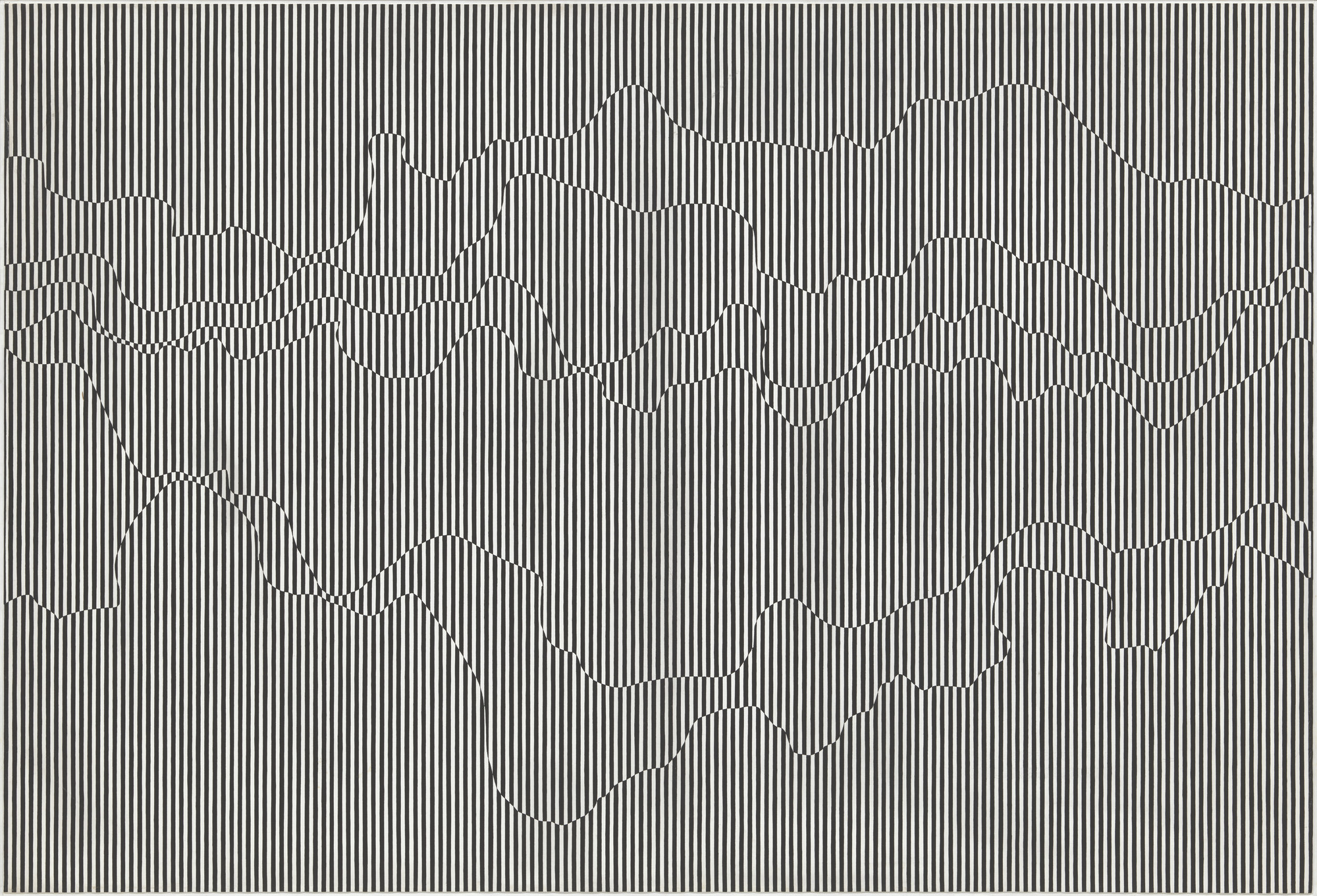
VISIBLE WAVES
Another way to create distortion is to turn a two-dimensional surface into a wave. Sound spheres or natural waves that add rhythmic beats to the composition. Check out the biomorphic worlds of Jesus Perea and the Sean Ward’s Chromatic Allucinations on Kooness.

THE VORTEX
Also known as a whirlpool, spiral, or cyclone, the vortex is a common Op Art and Kinetic paintings’ pattern. Round or elliptical, yet flat and bidimensional, shapes spin as fast as the vortex in the surreal short movie Anemic Cinema (1926) by Marcel Duchamp or in his earliest example of a readymade: The Bicycle Wheel (1913). Available on Kooness: Indian Shobha Broota's Artwork | The Silvietta whirling base handmade ceramic by Olimpia Zagnoli | Andrea Milano’s Photo.

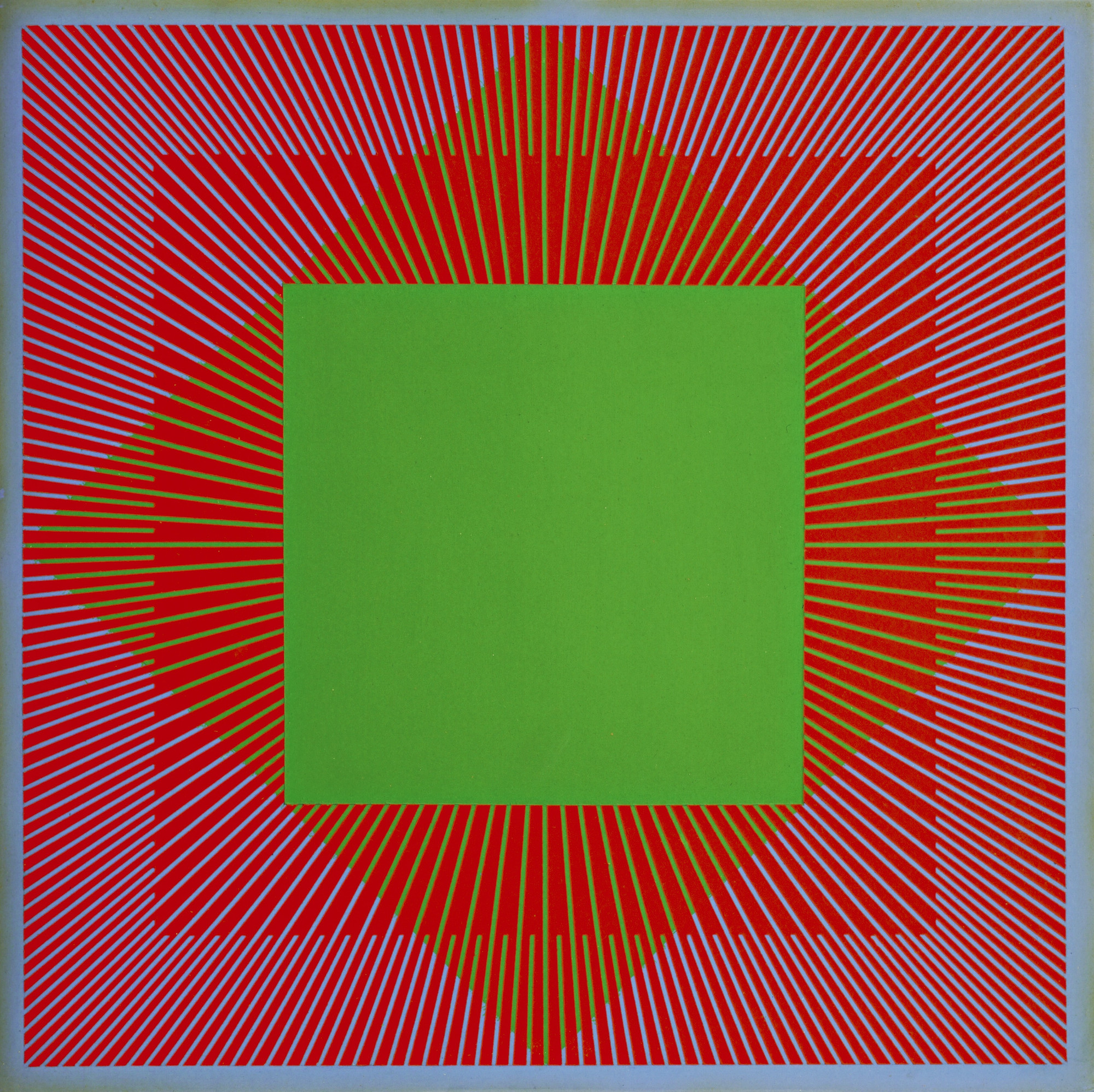
DIMENSIONAL VECTORS
Victor Vasarely (1908 - 1997) was a master of using vectors to transform shapes into forms. Destabilizing a regular figure and reversing the relationship between figure and background, he created an illusion of virtual movement and volume. Vasarely’s Untitled silkscreen from 1975 combines precise, symmetrical vectors with Geometric Shapes, horizontal and vertical lines and gradient colours. Take a look at Alberto Biasi’s Abstract Art available on Kooness.

Op Art: “Just an illusion”
It was in 1950 that Victor Vasarely, the leader of kinetic artists, added to his first graphic drawings, based on the tremor of black and white shapes and on the positive/negative contrast, an illusionistic component. He specialized in the field of virtual movement. Bridget Riley represents his ideal successor. After the invention of 3D Photo Graphismes - based on distortion and destabilization - Vasarely gave shape to his retinal titillations and developed new techniques: such as the sandblasting of thick sheets that changed optically according to visitors’ movements. Vasarely, however, had eminent historical precedents in the creation of this illusory art. Italian Futurists, Marcel Duchamp, the Dadaist László Moholy-Nagy and the sculptor Alexander Calder to name but a few. All ceded to the same impulse, to create moving paintings or objects under the sign of illusion.

The Responsive Eye
If 1964 wasn’t the year of Op Art, 1965 definitely was. Between February 23 and April 25 of that year, The Museum of Modern Art in New York City showed “The Responsive Eye”, an exhibition created and curated by William C. Seitz. Like the Op Art movement itself, the show focused on the perceptual aspects of artworks, those that proposed an idea of movement through an “apparent” change of perspective helped by certain color combinations. “The Responsive Eye” featured a wide range of pieces, 123 paintings and sculptures to be precise, from important figures such as Ellsworth Kelly, Alexander Liberman, Frank Stella, Victor Vasarely, Jesús Rafael Soto, Bridget Riley, Richard Anuszkiewicz, Getulio Alviani, Wen-Ying Tsai, Carlos Cruz-Diez and the Anonima group, among others.

Acrylic and fluorescent acrylic on canvas, 120 x 240 inches, Gift of Rose M. Shuey,
from the Collection of Dr. John and Rose M. Shuey CAM 2002.42
© Artists Rights Society (ARS), New York, New York. Photography by R. H. Hensleigh.
The exhibition had also been featured at art venues in the USA, such as St. Louis, Seattle, Pasadena and Baltimore, yet it failed to impress the critics, who hurried to express the movement’s shallowness and an attempt to win through cheap visual tricks. The audience, on the other hand - all 180,000 people who visited the show - loved it, turning it into one of the Most Popular Shows of the period. As many Op Art artists worked in the field of advertising, it is no wonder that the movement’s aesthetics spread on to posters, book illustrations, interior design, tv, but also clothes, sometimes without the artists’ permission. This commercialization eventually led to a decrease in popularity, and by 1968 Op Art fell out of the art lovers’ favour. Nevertheless, the work of its artists are still among the most sought ones on the Art Market, they belong to prestigious public and private collections, and they continue to inspire generations of other art-makers in both visual arts and architecture.
The Most Notable Op Art Artists
Victor Vasarely
Testifying best to the unique vision that Victor Vasarely embodied in Op Art is his “Zebra”, a painting created almost 30 years before the movement’s “official” start. The two animals are entwined by shadows and light, thick and thin lines, announcing what the artist firmly believed in - that the originality of an artwork lies in its meaning, rather than its rarity. He once said: “The celebrated transition from the representational to nonrepresentational art is only one of the stages of profound transformation taking place in the plastics arts. The term ‘abstract’ in painting refers not to an established fact, but to an irresistible trend towards plastic creation different from the kind we already know.” It almost seems impossible that Vasarely’s meticulous works came as a result of high technical skill, and not from a computer program.

Bridget Riley’s: Op of the Op
Bridget Riley is the star among Op Art painters. Born in London in 1931, she grew up in Cornwall where she received private instructions. In 1949, she enrolled at Goldsmith’s College of art and then she attended the Royal College of Art in London. Rather than drawing from the nude, Riley eventually - after several nervous breakdowns - found out her unique synthesis of landscape representation and chromatic impulse. Van Gogh, Jackson Pollock and mentor Maurice de Sausmarez (1915–1969), changed the course of Riley’s life. In 1968, she became the first woman painter ever to be awarded with the Grand Prize by the Venice Biennale. Her first retrospective in Germany in 1970 was seen by forty thousand visitors, an incredible number for a contemporary art solo show at that period. After the “everything sold out” (before opening) exhibition with Richard Feigenbaum in London, the fashion industry started to reproduce Riley’s work over everything, in countless Op Art imitations. Bridget Riley was so afraid of this unauthorized reproduction to take legal actions. But why such that acknowledgement? Following the interest in Futurism and Neo-Impressionism and her last figurative picture (Pink Landscape, 1960), Riley entered “black and white period”, the well-known phase of her entire career. Waves, stripes and lozenges, triangles, light-dark contrasts: a formal repertoire that imitate the scientific experiments’ optical illusions, surpassing the canon of hard-edge painting (the geometrical fluorescence experiments by Frank Stella above all else). Her signature style, a single colour flow of straight colours, transforms paintings into a pure rhythm, a stream of tensions and internal dynamics taken to the extreme. Just as Impressionists and Pointilists in the 19th Century, Bridget Riley has dedicated her life to the study of “The Eye’s Mind”, the title of her London exhibition in 1999. She has always been concerned with what she defines the “formal structure of seeing”: what we see undergoes light and colours’ changes. Bridget Riley is among the 25 Most Iconic Female Painters of the 20th Century.

© Bridget Riley 2014. All rights reserved. Courtesy of Karsten Schubert, London
Richard Anuszkiewicz
Working in Op Art across the pond from Vasarely and Riley, Richard Anuszkiewicz focused his oeuvre on colors, especially ones of high intensity, and what they do when are putting in different geometric forms. He studied at the Yale University School of Art and Architecture alongside Josef Albers, whose paintings also partially fall under the Op Art category - but much less so than those of Anuszkiewicz, who was interested in the dynamic, the changes both in singular colors and the composition as a whole caused by the change of light.
Exciting facts about Op Art: “Look, mum! it’s moving!”
- Op Art has something in common with the “anamorphosis effect”, the same distortion used by Leonardo da Vinci during the Renaissance
- Op Art is a product of the 1960s counterculture: The use of mind-altering psychedelic drugs such as LSD and mescaline, also in Art.
- Artist Donald Judd was the first to use the term “Op art” in his print review of Polish-born American painter and printmaker Julian Stanczak’s exhibition “Optical Paintings”. Judd dared to shorten the title and rhyming it with ''Pop Art”.
- «This is ridiculous. 'Optical [paintings],' what does it mean? For other paintings, you don't use your eyes?!», Stanczak responds to the provocation.
- “Gimmicks” was the judgemental label introduced by the famous critic Clement Greenberg to describe Op Art’s motifs.